Figma Motionでローディングアイコン作ってみた(無料配布あり)
Figma Motionがリリースされてしばらく経ちますが、当初は感動したものの、色々と制約がありいまいち使いこなせてない現状ですが、そんな中で、とりあえずローディングアイコンくらいは作れるだろうと試してみたのがこの記事です。
ローディングアイコンは奥が深いですね。とても勉強になりました。
Figma Motionの仕様・特徴
アニメーションはフレーム単位で書き出す
Figma Motionは、特定のフレーム内でアニメーションが発生し、そのフレームごとアニメーションを書き出すことになります。ここは注意が必要です。
モバイルのサイズなどでフレームを設定しておくと、スマホのプロダクトを作る際には直感的にサイズ感が感じ取れるので便利ではあります。ただ、場所や位置を問わず使用したい場合は、やはりフレームをトリミングした方が良さそうです。
フレームに対して総合タイムラインが存在し、そこで各オブジェクトやコンポーネントがアニメートするという形になります。この総合デュレーションに関しては、右の境界線をドラッグして調整します。
コンポーネントなど小要素のアニメーションについて
全体のタイムラインにおいて、各コンポーネントやオブジェクトのアニメーションが発生していない時、オブジェクトはアニメーション開始位置と終了位置で固まって止まっています。後述しますが、コンポーネントをその場でループアニメーションさせることはできません。
オブジェクトを消したい場合はOpacityなどを使用して非表示にするか、舞台から捌けるようにアニメートする必要があります。
コンポーネントのインスタンスは、全て同じアニメーションになり、アニメーションを変えることはできません。そのため、どう使うのが良いかというと、フレーム内で発生速度を遅らせれば全体のアニメーションの構成要素として使えます。が、待機中はやはり最後の状態で見た目が止まりますので、用途が限られます。
テキストアニメーションが微妙
Figma Motionにテキストアニメーションが追加されたと聞いて見に行ったら大変微妙な出来でした。
また、書き出し時にSVGを選択すると、アウトライン化されているにも関わらず、Figma通りに動きません。そのため、json(Lottie)か、webMなどで書き出す必要がありそうです。Lottieのほうが綺麗に書き出せますが少し重いです。バグなのかわからないので、様子見です。
とりあえず一個作ってみました。(webmを表示しています)
とりあえず動かすことは可能という感じに受け取っていますが、本格的にやるならAfter Effectsの方がかっこいいものができますね。特に、タイプライターのような一文字ずつ表示する、というようなシンプルなものすらプリセットには存在しませんでした。手作業でやるしかなさそうです。After Effectsにはすばらしい「これが欲しかった」テキストアニメーションのプリセットがたくさんあります。
After Effectsで作れるテキストアニメーション(プリセット)についてはこちら
複雑なアニメーションには向いてないと感じる
After EffectsはさすがAdobeだけあって、かなり複雑なVectorアニメーションが作れます。json書き出しにプラグインが必要ですが、公式からインストールできますし。
FigmaMotionはプリセットを見てもわかりますが、「力技で設定しているとしか思えない」アニメーションが結構ありました。これはAfter Effectsを常時使用している人からみると、わざわざFigmaで頑張らんでも、、と感じました。
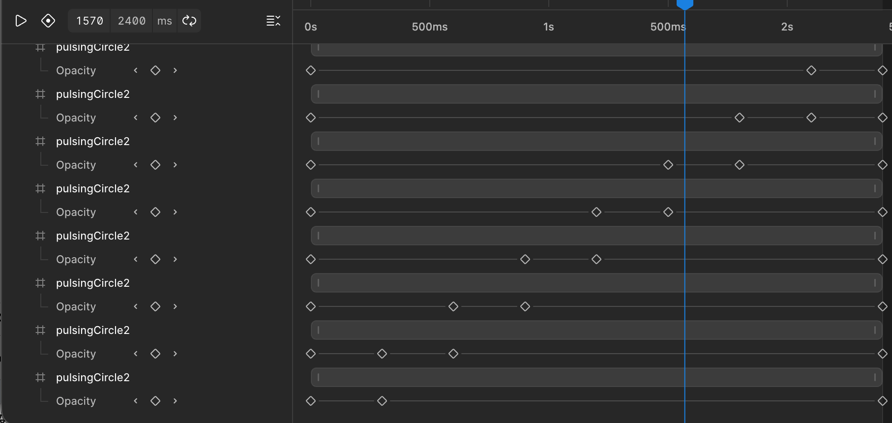
ちなみに、この右回りに丸が色づいてフェードアウトしていくアニメーション。
After Effectsならコンポジションを並べるだけでできそうです。
ですが、Figmaの場合フレーム全体のタイムラインに影響され、そのタイムライン内でコンポーネントのアニメをリピートすることができないのです!
そのため、全オブジェクトを配置したあと、キーフレームに色がつくタイミングをAIに計算してもらい、キーフレームは手打ちになってしまいました。非常に非効率的です。
CSSアニメーションについて
Figmaで作成したアニメーション(プロトではない)は、Devモードに行くとCSSアニメーションが書き出せます。
ちなみに上のアニメーションはCSSでは書き出しできません。複数のオブジェクトをまとめて動かせるCSSは、SVG書き出しをするとSVG内に書き込まれますので、そちらを利用します。
以下のように、丸が一個だけ存在するようなアニメーションは、CSS書き出しができますが、結局シェイプなどと組み合わせるので、今回の用途に関してはSVGの方が速そうですね。
ローディングアイコンのデザインについて
ローディングアイコンは、接続中だったり読み込み中に表示されるアニメーションです。そのため、気持ち速いスピードの方がイライラしなくて済むかなと、デザイナーの感覚として思いました。
コツとしては、順番に何かが発生するような並んでいるアニメーションの場合、2個目から食い気味にスタートさせると良い、ということです。ドミノを実際に見てみると、前のドミノが完全に倒れる前に次が倒れますよね。あんな感じです。綺麗で見ていて気持ちが良いですよね。
私は普段はアニメーション専門ではないので、感覚的に調整していく形になり、ここが最も時間がかかるなと感じました。
無料配布ローディングアイコン
よろしければお使いください!SVGソースコードの中で色が変更可能です。透過、色変更など自由にお試しください。
Figmaファイルでタイムラインを直接いじりたい方は、こちらのFigmaファイルを複製してお試しください。
Dots_pulse.svg
SVGソースコード
<svg width="200" height="200" viewBox="0 0 200 200" fill="none" xmlns="http://www.w3.org/2000/svg">
<style>
@keyframes kf_PulseDot_2_transform_0 {
  0% {
    transform: translate(13px, 13px) scaleX(1) scaleY(1) translate(-13px, -13px);
  }
  1.25% {
    transform: translate(13px, 13px) scaleX(0.8) scaleY(0.8) translate(-13px, -13px);
  }
  2.88% {
    transform: translate(13px, 13px) scaleX(0.8) scaleY(0.8) translate(-13px, -13px);
  }
  15% {
    transform: translate(13px, 13px) scaleX(1) scaleY(1) translate(-13px, -13px);
  }
  27.5% {
    transform: translate(13px, 13px) scaleX(1) scaleY(1) translate(-13px, -13px);
  }
  40% {
    transform: translate(13px, 13px) scaleX(1) scaleY(1) translate(-13px, -13px);
  }
  52.5% {
    transform: translate(13px, 13px) scaleX(1) scaleY(1) translate(-13px, -13px);
  }
  65% {
    transform: translate(13px, 13px) scaleX(1) scaleY(1) translate(-13px, -13px);
  }
  77.5% {
    transform: translate(13px, 13px) scaleX(1) scaleY(1) translate(-13px, -13px);
  }
  90% {
    transform: translate(13px, 13px) scaleX(1) scaleY(1) translate(-13px, -13px);
  }
  100% {
    transform: translate(13px, 13px) scaleX(1) scaleY(1) translate(-13px, -13px);
  }
}
@keyframes kf_PulseDot_2_opacity_0 {
  0% {
    animation-timing-function: linear;
    opacity: 1;
  }
  0.13% {
    animation-timing-function: linear;
    opacity: 1;
  }
  1.25% {
    animation-timing-function: linear;
    opacity: 0.2;
  }
  2.88% {
    animation-timing-function: linear;
    opacity: 0.2;
  }
  13.75% {
    animation-timing-function: linear;
    opacity: 1;
  }
  26.25% {
    animation-timing-function: linear;
    opacity: 1;
  }
  38.75% {
    animation-timing-function: linear;
    opacity: 1;
  }
  51.25% {
    animation-timing-function: linear;
    opacity: 1;
  }
  63.75% {
    animation-timing-function: linear;
    opacity: 1;
  }
  76.25% {
    animation-timing-function: linear;
    opacity: 1;
  }
  88.75% {
    animation-timing-function: linear;
    opacity: 1;
  }
  100% {
    opacity: 1;
  }
}
#PulseDot_2 {
  transform-origin: 0 0;
  animation:
    kf_PulseDot_2_transform_0 4s linear infinite,
    kf_PulseDot_2_opacity_0 4s linear infinite;
}
@keyframes kf_PulseDot_4_transform_0 {
  0% {
    transform: translate(13px, 13px) scaleX(1) scaleY(1) translate(-13px, -13px);
  }
  12.5% {
    transform: translate(13px, 13px) scaleX(1) scaleY(1) translate(-13px, -13px);
  }
  25% {
    transform: translate(13px, 13px) scaleX(1) scaleY(1) translate(-13px, -13px);
  }
  26.25% {
    transform: translate(13px, 13px) scaleX(0.8) scaleY(0.8) translate(-13px, -13px);
  }
  27.88% {
    transform: translate(13px, 13px) scaleX(0.8) scaleY(0.8) translate(-13px, -13px);
  }
  40% {
    transform: translate(13px, 13px) scaleX(1) scaleY(1) translate(-13px, -13px);
  }
  52.5% {
    transform: translate(13px, 13px) scaleX(1) scaleY(1) translate(-13px, -13px);
  }
  65% {
    transform: translate(13px, 13px) scaleX(1) scaleY(1) translate(-13px, -13px);
  }
  77.5% {
    transform: translate(13px, 13px) scaleX(1) scaleY(1) translate(-13px, -13px);
  }
  90% {
    transform: translate(13px, 13px) scaleX(1) scaleY(1) translate(-13px, -13px);
  }
  100% {
    transform: translate(13px, 13px) scaleX(1) scaleY(1) translate(-13px, -13px);
  }
}
@keyframes kf_PulseDot_4_opacity_0 {
  0% {
    animation-timing-function: linear;
    opacity: 1;
  }
  12.5% {
    animation-timing-function: linear;
    opacity: 1;
  }
  25% {
    animation-timing-function: linear;
    opacity: 1;
  }
  25.12% {
    animation-timing-function: linear;
    opacity: 1;
  }
  26.25% {
    animation-timing-function: linear;
    opacity: 0.2;
  }
  27.88% {
    animation-timing-function: linear;
    opacity: 0.2;
  }
  38.75% {
    animation-timing-function: linear;
    opacity: 1;
  }
  51.25% {
    animation-timing-function: linear;
    opacity: 1;
  }
  63.75% {
    animation-timing-function: linear;
    opacity: 1;
  }
  76.25% {
    animation-timing-function: linear;
    opacity: 1;
  }
  88.75% {
    animation-timing-function: linear;
    opacity: 1;
  }
  100% {
    opacity: 1;
  }
}
#PulseDot_4 {
  transform-origin: 0 0;
  animation:
    kf_PulseDot_4_transform_0 4s linear infinite,
    kf_PulseDot_4_opacity_0 4s linear infinite;
}
@keyframes kf_PulseDot_6_transform_0 {
  0% {
    transform: translate(13px, 13px) scaleX(1) scaleY(1) translate(-13px, -13px);
  }
  12.5% {
    transform: translate(13px, 13px) scaleX(1) scaleY(1) translate(-13px, -13px);
  }
  25% {
    transform: translate(13px, 13px) scaleX(1) scaleY(1) translate(-13px, -13px);
  }
  37.5% {
    transform: translate(13px, 13px) scaleX(1) scaleY(1) translate(-13px, -13px);
  }
  50% {
    transform: translate(13px, 13px) scaleX(1) scaleY(1) translate(-13px, -13px);
  }
  51.25% {
    transform: translate(13px, 13px) scaleX(0.8) scaleY(0.8) translate(-13px, -13px);
  }
  52.88% {
    transform: translate(13px, 13px) scaleX(0.8) scaleY(0.8) translate(-13px, -13px);
  }
  65% {
    transform: translate(13px, 13px) scaleX(1) scaleY(1) translate(-13px, -13px);
  }
  77.5% {
    transform: translate(13px, 13px) scaleX(1) scaleY(1) translate(-13px, -13px);
  }
  90% {
    transform: translate(13px, 13px) scaleX(1) scaleY(1) translate(-13px, -13px);
  }
  100% {
    transform: translate(13px, 13px) scaleX(1) scaleY(1) translate(-13px, -13px);
  }
}
@keyframes kf_PulseDot_6_opacity_0 {
  0% {
    animation-timing-function: linear;
    opacity: 1;
  }
  12.5% {
    animation-timing-function: linear;
    opacity: 1;
  }
  25% {
    animation-timing-function: linear;
    opacity: 1;
  }
  37.5% {
    animation-timing-function: linear;
    opacity: 1;
  }
  50% {
    animation-timing-function: linear;
    opacity: 1;
  }
  50.13% {
    animation-timing-function: linear;
    opacity: 1;
  }
  51.25% {
    animation-timing-function: linear;
    opacity: 0.2;
  }
  52.88% {
    animation-timing-function: linear;
    opacity: 0.2;
  }
  63.75% {
    animation-timing-function: linear;
    opacity: 1;
  }
  76.25% {
    animation-timing-function: linear;
    opacity: 1;
  }
  88.75% {
    animation-timing-function: linear;
    opacity: 1;
  }
  100% {
    opacity: 1;
  }
}
#PulseDot_6 {
  transform-origin: 0 0;
  animation:
    kf_PulseDot_6_transform_0 4s linear infinite,
    kf_PulseDot_6_opacity_0 4s linear infinite;
}
@keyframes kf_PulseDot_8_transform_0 {
  0% {
    transform: translate(13px, 13px) scaleX(1) scaleY(1) translate(-13px, -13px);
  }
  12.5% {
    transform: translate(13px, 13px) scaleX(1) scaleY(1) translate(-13px, -13px);
  }
  25% {
    transform: translate(13px, 13px) scaleX(1) scaleY(1) translate(-13px, -13px);
  }
  37.5% {
    transform: translate(13px, 13px) scaleX(1) scaleY(1) translate(-13px, -13px);
  }
  50% {
    transform: translate(13px, 13px) scaleX(1) scaleY(1) translate(-13px, -13px);
  }
  62.5% {
    transform: translate(13px, 13px) scaleX(1) scaleY(1) translate(-13px, -13px);
  }
  75% {
    transform: translate(13px, 13px) scaleX(1) scaleY(1) translate(-13px, -13px);
  }
  76.25% {
    transform: translate(13px, 13px) scaleX(0.8) scaleY(0.8) translate(-13px, -13px);
  }
  77.88% {
    transform: translate(13px, 13px) scaleX(0.8) scaleY(0.8) translate(-13px, -13px);
  }
  90% {
    transform: translate(13px, 13px) scaleX(1) scaleY(1) translate(-13px, -13px);
  }
  100% {
    transform: translate(13px, 13px) scaleX(1) scaleY(1) translate(-13px, -13px);
  }
}
@keyframes kf_PulseDot_8_opacity_0 {
  0% {
    animation-timing-function: linear;
    opacity: 1;
  }
  12.5% {
    animation-timing-function: linear;
    opacity: 1;
  }
  25% {
    animation-timing-function: linear;
    opacity: 1;
  }
  37.5% {
    animation-timing-function: linear;
    opacity: 1;
  }
  50% {
    animation-timing-function: linear;
    opacity: 1;
  }
  62.5% {
    animation-timing-function: linear;
    opacity: 1;
  }
  75% {
    animation-timing-function: linear;
    opacity: 1;
  }
  75.13% {
    animation-timing-function: linear;
    opacity: 1;
  }
  76.25% {
    animation-timing-function: linear;
    opacity: 0.2;
  }
  77.88% {
    animation-timing-function: linear;
    opacity: 0.2;
  }
  88.75% {
    animation-timing-function: linear;
    opacity: 1;
  }
  100% {
    opacity: 1;
  }
}
#PulseDot_8 {
  transform-origin: 0 0;
  animation:
    kf_PulseDot_8_transform_0 4s linear infinite,
    kf_PulseDot_8_opacity_0 4s linear infinite;
}
</style>
<g id="Dots_002_Pulse" clip-path="url(#clip0_83_350)">
<rect width="200" height="200" id="Dots_002_Pulse_bg_0" fill="white">
</rect>
<g id="Frame_3" transform="translate(30 87)">
<g id="PulseDot">
<circle id="PulseDot_2" cx="13" cy="13" r="13" fill="#B8C4CD"/>
</g>
<g id="PulseDot_3" transform="translate(38)">
<circle id="PulseDot_4" cx="13" cy="13" r="13" fill="#B8C4CD"/>
</g>
<g id="PulseDot_5" transform="translate(76)">
<circle id="PulseDot_6" cx="13" cy="13" r="13" fill="#B8C4CD"/>
</g>
<g id="PulseDot_7" transform="translate(114)">
<circle id="PulseDot_8" opacity="0.720299" cx="13" cy="13" r="13" fill="#B8C4CD"/>
</g>
</g>
</g>
<defs>
<clipPath id="clip0_83_350">
<rect width="200" height="200" fill="white"/>
</clipPath>
</defs>
</svg>
Circle_to_Right.svg
SVGソースコード
<svg width="200" height="200" viewBox="0 0 200 200" fill="none" xmlns="http://www.w3.org/2000/svg">
<style>
@keyframes kf_pulsingCircle2_opacity_0 {
  0% {
    animation-timing-function: cubic-bezier(0.5, 0, 0.5, 1);
    opacity: 1;
  }
  12.5% {
    animation-timing-function: cubic-bezier(0.5, 0, 0.5, 1);
    opacity: 0;
  }
  100% {
    opacity: 0.992;
  }
}
#pulsingCircle2 {
  animation: kf_pulsingCircle2_opacity_0 2.4s linear infinite;
}
@keyframes kf_pulsingCircle2_2_opacity_0 {
  0% {
    animation-timing-function: cubic-bezier(0.5, 0, 0.5, 1);
    opacity: 0.857;
  }
  12.5% {
    animation-timing-function: cubic-bezier(0.5, 0, 0.5, 1);
    opacity: 1;
  }
  25% {
    animation-timing-function: cubic-bezier(0.5, 0, 0.5, 1);
    opacity: 0;
  }
  100% {
    opacity: 0.849;
  }
}
#pulsingCircle2_2 {
  animation: kf_pulsingCircle2_2_opacity_0 2.4s linear infinite;
}
@keyframes kf_pulsingCircle2_3_opacity_0 {
  0% {
    animation-timing-function: cubic-bezier(0.5, 0, 0.5, 1);
    opacity: 0.714;
  }
  25% {
    animation-timing-function: cubic-bezier(0.5, 0, 0.5, 1);
    opacity: 1;
  }
  37.5% {
    animation-timing-function: cubic-bezier(0.5, 0, 0.5, 1);
    opacity: 0;
  }
  100% {
    opacity: 0.706;
  }
}
#pulsingCircle2_3 {
  animation: kf_pulsingCircle2_3_opacity_0 2.4s linear infinite;
}
@keyframes kf_pulsingCircle2_4_opacity_0 {
  0% {
    animation-timing-function: cubic-bezier(0.5, 0, 0.5, 1);
    opacity: 0.571;
  }
  37.5% {
    animation-timing-function: cubic-bezier(0.5, 0, 0.5, 1);
    opacity: 1;
  }
  50% {
    animation-timing-function: cubic-bezier(0.5, 0, 0.5, 1);
    opacity: 0;
  }
  100% {
    opacity: 0.563;
  }
}
#pulsingCircle2_4 {
  animation: kf_pulsingCircle2_4_opacity_0 2.4s linear infinite;
}
@keyframes kf_pulsingCircle2_5_opacity_0 {
  0% {
    animation-timing-function: cubic-bezier(0.5, 0, 0.5, 1);
    opacity: 0.429;
  }
  50% {
    animation-timing-function: cubic-bezier(0.5, 0, 0.5, 1);
    opacity: 1;
  }
  62.5% {
    animation-timing-function: cubic-bezier(0.5, 0, 0.5, 1);
    opacity: 0;
  }
  100% {
    opacity: 0.421;
  }
}
#pulsingCircle2_5 {
  animation: kf_pulsingCircle2_5_opacity_0 2.4s linear infinite;
}
@keyframes kf_pulsingCircle2_6_opacity_0 {
  0% {
    animation-timing-function: cubic-bezier(0.5, 0, 0.5, 1);
    opacity: 0.286;
  }
  62.5% {
    animation-timing-function: cubic-bezier(0.5, 0, 0.5, 1);
    opacity: 1;
  }
  75% {
    animation-timing-function: cubic-bezier(0.5, 0, 0.5, 1);
    opacity: 0;
  }
  100% {
    opacity: 0.278;
  }
}
#pulsingCircle2_6 {
  animation: kf_pulsingCircle2_6_opacity_0 2.4s linear infinite;
}
@keyframes kf_pulsingCircle2_7_opacity_0 {
  0% {
    animation-timing-function: cubic-bezier(0.5, 0, 0.5, 1);
    opacity: 0.143;
  }
  75% {
    animation-timing-function: cubic-bezier(0.5, 0, 0.5, 1);
    opacity: 1;
  }
  87.5% {
    animation-timing-function: cubic-bezier(0.5, 0, 0.5, 1);
    opacity: 0;
  }
  100% {
    opacity: 0.135;
  }
}
#pulsingCircle2_7 {
  animation: kf_pulsingCircle2_7_opacity_0 2.4s linear infinite;
}
@keyframes kf_pulsingCircle2_8_opacity_0 {
  0% {
    animation-timing-function: cubic-bezier(0.5, 0, 0.5, 1);
    opacity: 0;
  }
  87.5% {
    animation-timing-function: cubic-bezier(0.5, 0, 0.5, 1);
    opacity: 1;
  }
  100% {
    opacity: 0;
  }
}
#pulsingCircle2_8 {
  animation: kf_pulsingCircle2_8_opacity_0 2.4s linear infinite;
}
</style>
<g id="Circle_toRight" clip-path="url(#clip0_25_2531)">
<rect width="200" height="200" id="Circle_toRight_bg_0" fill="white">
</rect>
<g id="Group_3" transform="translate(14 14)">
<g id="pulsingCircle2" transform="translate(71)">
<circle id="Ellipse_1" cx="15" cy="15" r="15" fill="#B8C4CD"/>
</g>
<g id="pulsingCircle2_2" transform="translate(136.205 57.0086) rotate(-135)">
<circle id="Ellipse_1_2" cx="15" cy="15" r="15" fill="#B8C4CD"/>
</g>
<g id="pulsingCircle2_3" transform="matrix(0 -1 1 0 142 101)">
<circle id="Ellipse_1_3" cx="15" cy="15" r="15" fill="#B8C4CD"/>
</g>
<g id="pulsingCircle2_4" transform="translate(114.991 136.205) rotate(-45)">
<circle id="Ellipse_1_4" cx="15" cy="15" r="15" fill="#B8C4CD"/>
</g>
<g id="pulsingCircle2_5" transform="translate(71 142)">
<circle id="Ellipse_1_5" cx="15" cy="15" r="15" fill="#B8C4CD"/>
</g>
<g id="pulsingCircle2_6" transform="translate(35.7954 157.418) rotate(-135)">
<circle id="Ellipse_1_6" cx="15" cy="15" r="15" fill="#B8C4CD"/>
</g>
<g id="pulsingCircle2_7" transform="matrix(0 -1 1 0 0 101)">
<circle id="Ellipse_1_7" cx="15" cy="15" r="15" fill="#B8C4CD"/>
</g>
<g id="pulsingCircle2_8" transform="translate(14.5822 35.7954) rotate(-45)">
<circle id="Ellipse_1_8" cx="15" cy="15" r="15" fill="#B8C4CD"/>
</g>
</g>
</g>
<defs>
<clipPath id="clip0_25_2531">
<rect width="200" height="200" fill="white"/>
</clipPath>
</defs>
</svg>
Orbit_002.svg
ちなみにこちらの、グラデーションのあるSVGを緩急つけながら回すアニメーション、Figmaから直接書き出しすると壊れました。解決策としては、グラデーションのついた静止画のSVGを書き出し、CSSアニメーションを別途書き出ししてくっつけています。こういうときはCSSアニメーションの知識が活きますね(非常に簡単ではありますが)。しかし、なぜ一発で書き出せなかったのか、謎です。グラデーションが複雑だから、というのがAIの見解でした。
SVGソースコード
<svg width="134" height="134" viewBox="0 0 134 134" fill="none" xmlns="http://www.w3.org/2000/svg" id="orbit002">
<style>
@keyframes kf_Ellipse_7__Stroke__transform_0 {
0% {
transform: translateX(33px) translateY(33px) translate(67px, 66.757px) rotate(0rad) translate(-67px, -66.757px);
}
24.87% {
transform: translateX(33px) translateY(33px) translate(67px, 66.757px) rotate(0.962rad) translate(-67px, -66.757px);
}
49.74% {
transform: translateX(33px) translateY(33px) translate(67px, 66.757px) rotate(4.897rad) translate(-67px, -66.757px);
}
74.62% {
transform: translateX(33px) translateY(33px) translate(67px, 66.757px) rotate(6.009rad) translate(-67px, -66.757px);
}
99.49% {
transform: translateX(33px) translateY(33px) translate(67px, 66.757px) rotate(6.278rad) translate(-67px, -66.757px);
}
100% {
transform: translateX(33px) translateY(33px) translate(67px, 66.757px) rotate(6.279rad) translate(-67px, -66.757px);
}
}
#orbit002{
transform-origin: 0 0;
animation: kf_Ellipse_7__Stroke__transform_0 2.010298s linear infinite;
}
</style>
<g clip-path="url(#paint0_angular_17_448_clip_path)" data-figma-skip-parse="true"><g transform="matrix(-0.0285 0.063243 -0.0634733 -0.0286038 67 66.757)"><foreignObject x="-1560.2" y="-1560.2" width="3120.39" height="3120.39"><div xmlns="http://www.w3.org/1999/xhtml" style="background:conic-gradient(from 90deg,rgba(255, 255, 255, 1) 0deg,rgba(184, 196, 205, 1) 360deg);height:100%;width:100%;opacity:1"></div></foreignObject></g></g><path d="M119 67C119 38.2812 95.7188 15 67 15C38.2812 15 15 38.2812 15 67C15 85.3737 24.5238 101.528 38.9395 110.788C42.4242 113.027 43.4348 117.666 41.1963 121.151C38.9576 124.636 34.3171 125.647 30.832 123.408C12.3024 111.505 0 90.6917 0 67C0 29.9969 29.9969 0 67 0C104.003 0 134 29.9969 134 67C134 101.091 108.544 129.226 75.6006 133.452C71.4923 133.979 67.7352 131.076 67.208 126.968C66.6809 122.859 69.5839 119.101 73.6924 118.574C99.2472 115.296 119 93.4486 119 67Z" data-figma-gradient-fill="{"type":"GRADIENT_ANGULAR","stops":[{"color":{"r":1.0,"g":1.0,"b":1.0,"a":1.0},"position":0.0},{"color":{"r":0.72156864404678345,"g":0.76862746477127075,"b":0.80392158031463623,"a":1.0},"position":1.0}],"transform":{"m00":-57.000007629394531,"m01":-126.94660186767578,"m02":158.97331237792969,"m10":126.48609161376953,"m11":-57.207534790039062,"m12":32.117675781250},"opacity":1.0,"blendMode":"NORMAL","stopsVar":[{"color":{"r":1.0,"g":1.0,"b":1.0,"a":1.0},"position":0.0},{"color":{"r":0.72156864404678345,"g":0.76862746477127075,"b":0.80392158031463623,"a":1.0},"position":1.0}],"visible":true}"/>
<defs>
<clipPath id="paint0_angular_17_448_clip_path"><path d="M119 67C119 38.2812 95.7188 15 67 15C38.2812 15 15 38.2812 15 67C15 85.3737 24.5238 101.528 38.9395 110.788C42.4242 113.027 43.4348 117.666 41.1963 121.151C38.9576 124.636 34.3171 125.647 30.832 123.408C12.3024 111.505 0 90.6917 0 67C0 29.9969 29.9969 0 67 0C104.003 0 134 29.9969 134 67C134 101.091 108.544 129.226 75.6006 133.452C71.4923 133.979 67.7352 131.076 67.208 126.968C66.6809 122.859 69.5839 119.101 73.6924 118.574C99.2472 115.296 119 93.4486 119 67Z"/></clipPath></defs>
</svg>